Super excited to share what I have designed for the Dazed poster project that communicates messages created in response to the changes that COVID-19 has brought to lives worldwide, promoting reflections of the now, positive future narratives and new ideas. Dazed called on its community of artists, musicians and designers to create artworks that inspire and imagine the possibility of new worlds, explore humanity in the present climate, and demonstrate the power of art as a medium for political message.
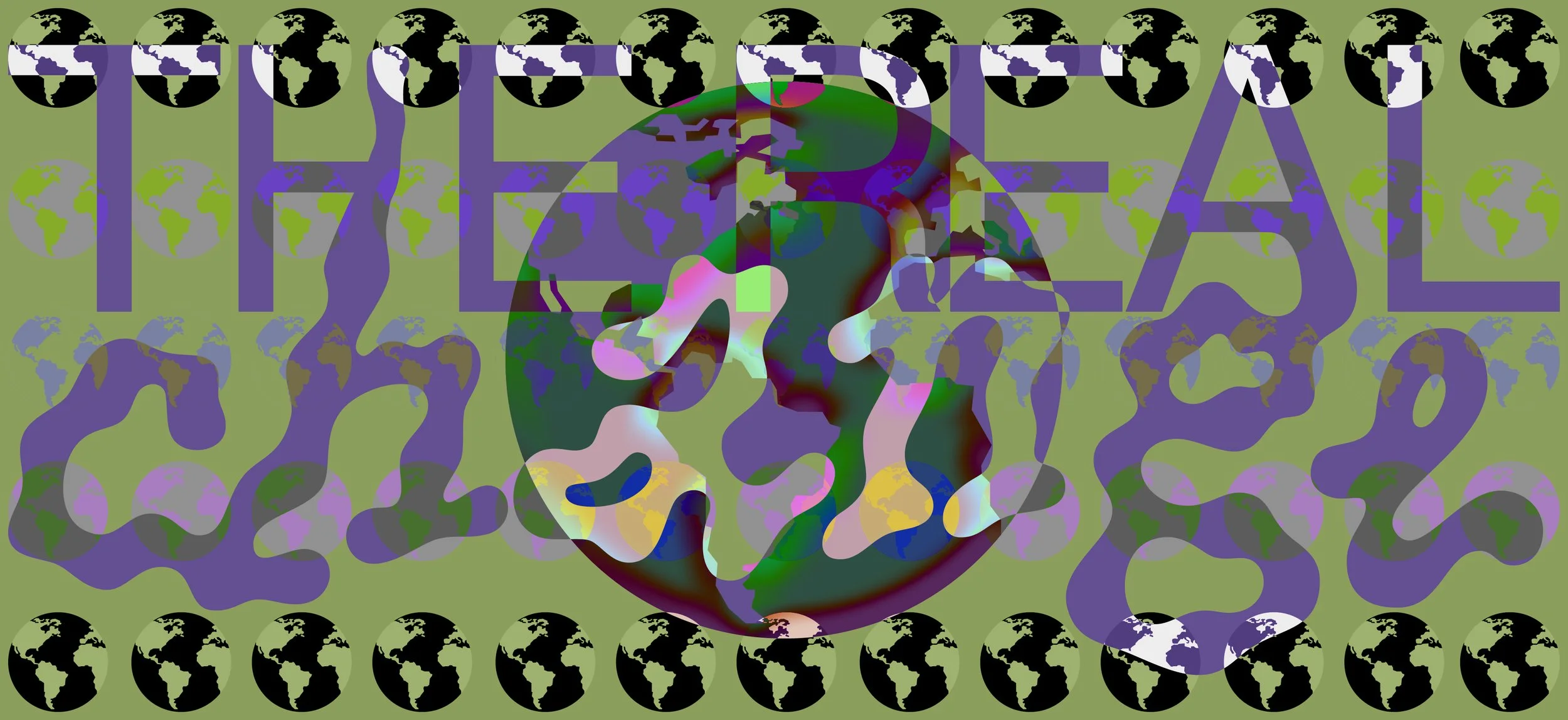
My poster is called Satori: a Japanese Buddhist term for awakening—the acquiring of a new point of view in our dealings with life and the world. Now more than ever I am aware of rural borders, since these have been closed in Belgium due to Corona. Freedom is no longer about physical movement, but has to take place in your head. I did not want to create borders for myself for this design, so I decided I would allow my intuitive side to take over. It became a smiling face that is embraced by a comforting organic form that has a similar smile. As if I drew my soul that wants to still my thoughts. These shapes stand together and yet alone: an answer that can be given to the old Dazed slogan ‘how does it make you feel’ in these weird times.
As part of the campaign, Dazed Media has partnered with BartsCharity, who support the work of staff at the Barts Health NHS Trust, who are on the frontline of the COVID-19 outbreak. They are raising emergency funds to help staff cope with the challenges they’re facing everyday.
Vivienne Westwood, Wolfgang Tillmans, Katharine Hamnett, Jefferson Hack in collaboration with David Wise at Forthcoming Studio, Christopher Kane, Charles Jeffrey, 3D (Massive Attack), Fai Khadra, Peter Kennard x Jamie Reid, Matty Bovan, Gaika, Kris Andrew Small, Jonas Lindstroem, Margot Bowman, Lotte Andersen, William Farr, George Rouy, Wilson Oryema, Kingsley Ifill, M/M Paris, Stephanie Specht, Polly Nor and Samuel Ross have donated their limited edition signed artworks to a prize draw.
Designed in 2020.